
Insights: Dashboard
👤 Insights are available to Administrators, Billers, and Practitioners with billing access.
The Account Insights Dashboard gives you a high‑level view of your practice’s activity. You can filter the dashboard by clinician if you are part of a group practice, or choose All to view practice‑wide totals.
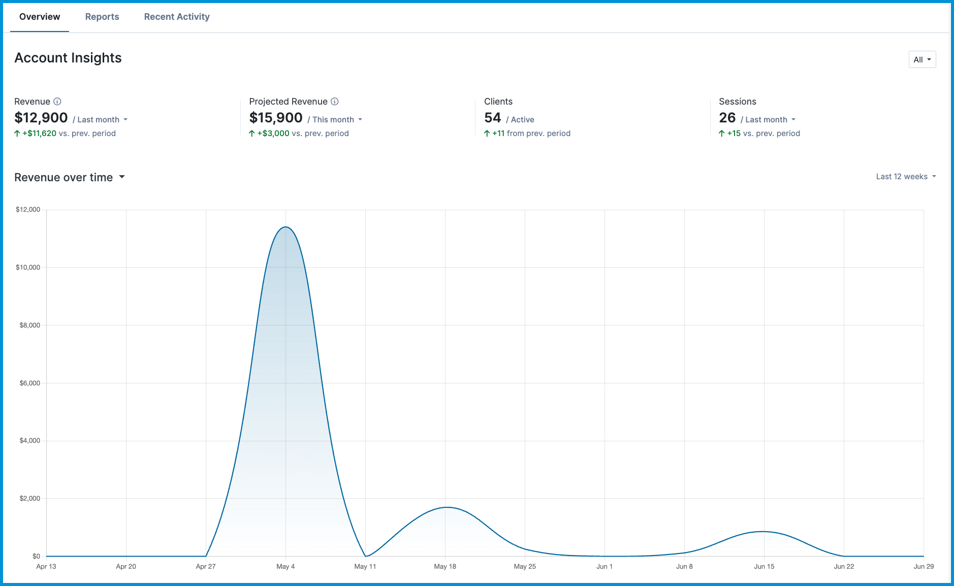
↕️ Trend arrows show increases or decreases compared to the previous period.
In this article:
- Revenue
- Projected Revenue
- Clients
- Sessions
- Trends Over Time Chart
- Frequently Asked Questions
- Related Resources
Revenue
The Revenue tile shows payments recorded for the selected timeframe.
| Timeframe | Description |
|---|---|
| Last Month | Calculated by looking at all recorded payments for last month. |
| Month to Date | Calculated by looking at all recorded payments for the current month to date. |
| Last 30 Days | Calculated by looking at all recorded payments over the last 30 days. |
Projected Revenue
The Projected Revenue tile shows the total service price of scheduled appointments for the selected timeframe.
| Timeframe | Description |
|---|---|
| This Month | Calculated by looking at the service price for all scheduled appointments for this month. |
| Next Month | Calculated by looking at the service price for all scheduled appointments over the next month. |
| Next 30 Days | Calculated by looking at the service price for all scheduled appointments over the next 30 days. |
Clients
The Clients tile shows your total number of currently active clients and whether that number increased or decreased compared to the previous 30-day period.
Sessions
The Sessions tile shows the number of sessions held during the selected timeframe.
| Timeframe | Description |
|---|---|
| Last Month | Calculated by looking at all sessions held last month. |
| Last 30 Days | Calculated by looking at all sessions held over the last 30 days. |
Trends Over Time Chart
The Trends Over Time chart helps you visualize changes in Revenue, Clients, or Sessions across different timeframes.
Use the dropdown menu above the chart to switch between metrics.
| Chart Option | What It Shows |
|---|---|
| Revenue | Payments received over time for the selected timeframe. |
| Clients | Active client count trends over time. |
| Sessions | Completed sessions over time for the selected timeframe. |
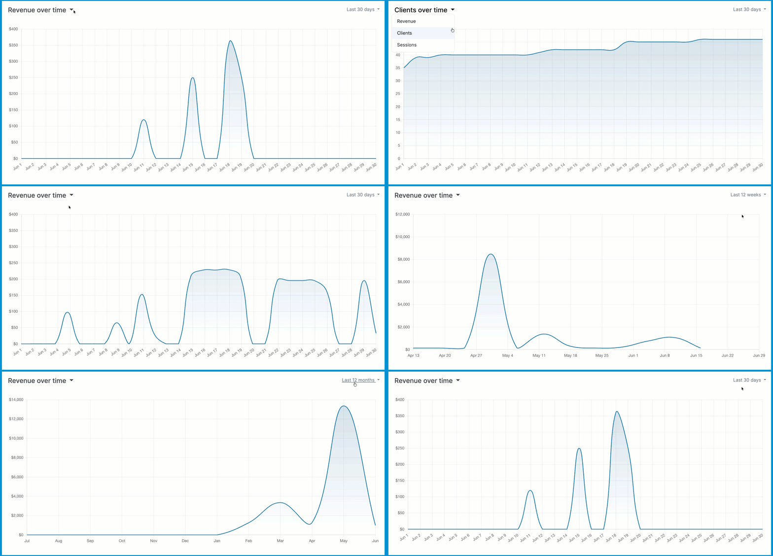
🗓️ You can also adjust the chart’s timeframe to view data for the Last 30 Days, Last 12 Weeks, or Last 12 Months from the upper right corner of the graph.
Frequently Asked Questions
Why do my numbers look different from last week?
The timeframe you select changes how each tile is calculated. Try switching between Last Month and Last 30 Days to compare.
Why don't I see this page?
Insights are only available to Administrators, Billers, and Practitioners with billing access. If you don't see this page, your administrator may need to adjust your permissions from your Account Settings.
Does filtering by clinician change all tiles?
Yes. When you filter by clinician, all tiles and charts update to show data for that clinician only.
Related Resources
For more details on related features and financial reporting, explore these articles: